Top 5 Most Common Website Design Mistakes
filed in:
Does Your Website Need An Update?
Your website is your digital storefront – the first impression potential clients have of your business and the gateway to your services and products. But here’s the thing: if your website design feels cluttered or amateurish, visitors will leave before they even get a chance to know what you’re all about. And that means missed opportunities for you.
I get it. As a small business owner or entrepreneur, budget constraints can make it tempting to DIY your website. But here’s the reality: if your website design lacks style and professionalism, you’re not going to see the sales and leads you need to thrive. In today’s world, aesthetics matter. People are drawn to website designs that look current and trendy – and if yours doesn’t fit the bill, you risk losing credibility with your audience.
That’s where hiring a pro comes in. Investing in professional website design might seem like a big expense upfront, but trust me – it pays off. And if budget is a concern, there are affordable options like website templates that still have a designer’s touch.
Now, let’s talk about some of the most common website design mistakes I’ve seen.
1. No Clear Message
What’s the first thing you want visitors to know about your business when they land on your website? If it’s not crystal clear as soon as your visitors land on the page, you might be missing out on valuable opportunities. Research shows that visitors form an opinion about your brand in just half a second – so, make sure your website design helps to send a clear message.
One of the biggest pitfalls I see on small business websites is the lack of a clear call to action. Your website should be guiding visitors like a friendly usher at a theater, directing them exactly where they need to go. Whether it’s a button that says “Buy Now,” “Contact Me,” or “View My Services,” every click should feel purposeful and intuitive.
So, what’s your website design’s main mission? Is it to grab more testimonials, make sales, or grow your email list? Whatever it is, yell from the digital rooftops! Prominently feature your primary call to action so visitors know exactly what you want them to do. After all, clarity breeds action.
2. Not Compressing Images
One of the biggest culprits behind slow websites is image compression, yet it’s often overlooked. But here’s the deal: compressing your image files can work wonders for your site’s speed and SEO. If your pages take forever to load, visitors are likely to bail out in frustration.
Your mission? Compress those images to strike the perfect balance between file size and quality. And don’t forget to choose the right format – PNG for top-notch quality, JPEG for a smaller size that’s still adjustable.
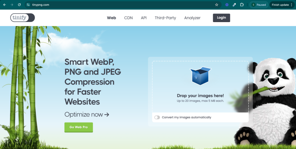
My go-to for image compression? TinyPNG. And if you’re on WordPress, check out the WP Smush plugin for hassle-free bulk compression or manual tweaking of your blog post images. Trust me, your visitors will thank you for the speed boost!

3. Cheesy/Repetitive Stock Photos
Choosing the right images for your website design can make all the difference. Stock photos can be convenient but typically often lack originality and personality. That’s why I’m a big believer in using authentic, original imagery whenever possible.
Now, I get it – professional photoshoots can be pricey, especially for new businesses. But don’t worry, there are plenty of free stock photo sites like Unsplash, Pexels, and Kaboompics where you can find high-quality images without breaking the bank. And if you’re looking for feminine stock photos with a touch of flair, Haute Stock has you covered with their amazing membership.
Personally, I’m always on the hunt for fresh, unique images. If I’ve seen a particular photo plastered across multiple websites and social media feeds, I leave it alone. Sure, it might be a nice picture, but overused images can take away your brand’s identity.

4. No favicon
In our search for services or products, we’re often met with a sea of Google links, each asking for our attention. Some tabs stay open, bookmarked for later perusal, while others are swiftly closed.
But don’t worry – enter favicons, the unsung heroes of browsing! These tiny photos at the top of our browsers are big in helping visitors recognize and revisit your website tab.

5. Poor Typography
When I’m putting together websites, I stick to a simple rule: no more than three fonts. Keeping it to 2-3 fonts usually works best for a sleek website design, as long as they complement each other nicely. Mixing fonts that clash can be a real distraction and steal the spotlight from your website’s main message.
Another thing I keep in mind is readability. I try to steer clear of using script fonts too much, especially for important headings. For the main text, I prefer using sans-serif fonts since they’re easier on the eyes. Script fonts are reserved for those quick, eye-catching bits of text.
Wrapping Up
I get it – website design can be a whole other world, especially for small business owners juggling a million things. That’s where a designer can swoop in and work their magic, crafting a top-notch user experience that’ll boost your online presence.
Feeling stuck? I have your back with custom design options and ready-made templates that’ll take your website to the next level. Let’s brainstorm together and make something awesome happen!
@BRANDCHOREGORAPHER